
Social media engagement is hard. First of all, how do you get people to engage? Secondly, how do you know if it worked? Today I want to review three recent LinkedIn posts on my personal account. What types of posts performed best? What does “performed best” even mean?
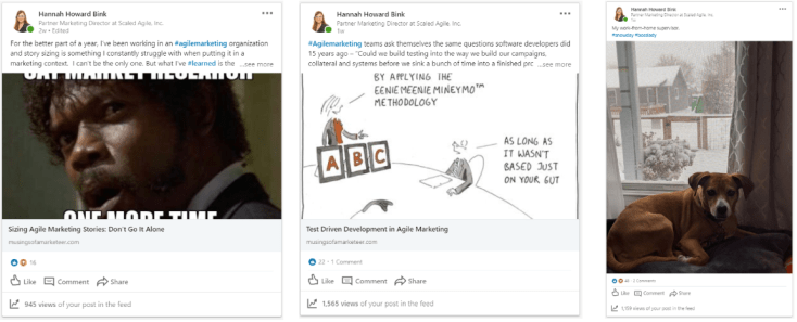
The first post promoted a blog article on sizing stories for agile marketers. I categorize this as high segmentation, low technical knowledge topic. The second post was released a week later and promoted a blog article on test driven development (or TDD) for agile marketers. I categorize this as high segmentation, high technical knowledge. The third was a photo of my dog, Delilah, with a simple caption. This is low segmentation, low technical knowledge. The distribution channel for all three posts was LinkedIn. They were not promoted on any additional channels.
Engagement Metric 1: Views
According to LinkedIn, when you share an update, a “view” is counted when the update is loaded on the viewer’s screen. Viewers do not necessarily need to click or read the update to count as a view, but rather have the update loaded on their Homepage.
Views (at the time of this writing):
- Sizing Article = 936
- Photo = 1,138
- TDD Article = 1,547
So what?
To me views are a vanity metric. There is dependency on your network size and how many people logged-in that day at that time. However, if we think about this in the larger context of time, the photo and the TDD article, which have higher view rates, were both released just a few days before a major holiday for the majority of my network, Thanksgiving. The Sizing article was released a week earlier.
This reminds me of my best performing email, which I sent years back. I emailed our distribution list a whitepaper two days before Christmas Eve, a day most Americans have off work, and got over a 30% open rate and 10% click-thru rate. The email wasn’t extraordinary – the timing was. I believe it was the fact that people don’t get a lot of work emails right before major holidays, which lended to extremely high open rates. The same could be postulated for social views. The closer to a major holiday, the lighter the workload, the more views on social platforms. Worth a few experiments to validate.
Engagement Metric 2: Likes & Engagement Rate
Both articles performed comparably when it comes to like volume – 16 for the sizing article and 22 for the TDD article. However, the photo doubled that with 48 likes. But why? Although the blog posts have images, they are small and located at the bottom of the post, while Delilah is the central focus on her own post. What’s more, the Delilah post takes no effort from the viewer, while the other posts require the audience to pause and read.
Less effort + optimum cuteness = more post engagement.
Likes:
- Sizing Article = 16 likes, 0 comments
- Photo = 48 likes, 2 comments
- TDD Article = 22 likes, 1 comment
Engagement Rate:
- Sizing Article = 1.7%
- Photo = 4.2%
- TDD Article = 1.4%
Engagement Metric 3: Click-thru Rate
The photo post obviously doesn’t have a Click-Thru Rate (CTR) so no need to discuss that one. However, I compared the number of views to the volume of traffic I got on the blog posts to calculate a CTR for the other two. The sizing article achieved a 8.3% CTR, good by any measure. The TDD article only achieved 1.9% – still good, but not great. Remember the sizing article had 65% fewer views than the TDD article, but the click-thru rate is off the chart. Why?
I believe this is because of the technical nature of the articles. The TDD article requires enough technical knowledge to know what “Test Driven Development” even means, or at least to be curious enough to find out. Story sizing, on the other hand, is much more well known within agile communities and only requires a basic knowledge of agile itself.
This theory is supported by the engagement audiences. I looked at the people who liked or commented on the respective posts and saw an interesting trend. Delilah’s photo got the greatest variation in audience, with 50% marketing/sales, 20% professional agilists and 30% other. Reason? Puppies are universally cute.
The sizing article had engagement from 69% marketing/sales, 25% professional agilists and 5% other. Finally, the TDD article – the most technical of the three – attracted a 72% professional agilist audience, 14% marketing/sales audience and 9% other. The nerds have spoken.
So what do you do with all of this?
Keep in mind, this is one test on one network in one time frame. However, it comes back to defining your social media goals up front. Is your goal to reach a specific audience, gain online popularity, or just have fun? You can use these findings as a guide to hone your strategy and understand what “good” means.
Have your own social media findings or tests? Let me know in the comments below.

Leave a comment